© Edward Hopper
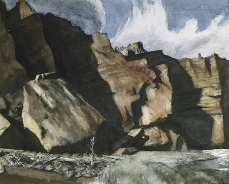
Everything inside the frame is the same material, the same kind of texture, lit by the same light. Nothing fights the tree. That's exclusion working at the level of what the painting refuses to include.
A Visual Companion
Simplicity is not about removing things. It is about clarifying what the picture is actually about. An empty image is not a simple image. An empty image is one that has nothing to say. A simple image is one that has a clear focus, where one idea dominates and everything else gets out of its way.
The work of simplifying happens twice. Once in how you see the scene, before you ever raise the camera. Again when you edit the image, where you keep deciding what matters and what doesn't. Both stages ask the same question. What is this picture actually about? If you can't answer that in a sentence, you don't yet know what to keep and what to let go.
A complex scene can still be a simple picture if one idea clearly dominates. That's the move. Not minimalism for its own sake, not empty frames, but pictures with a center of gravity. Everything in the frame either holds that center or it doesn't belong there.
This guide walks through four ways simplicity actually shows up in a photograph: exclusion, dominance, tonal hierarchy, and the relationship between form and space. These aren't rules. They're the questions I ask of my own work, and the ones I want you asking of yours.
© Edward Hopper
Everything inside the frame is the same material, the same kind of texture, lit by the same light. Nothing fights the tree. That's exclusion working at the level of what the painting refuses to include.
© RRjr
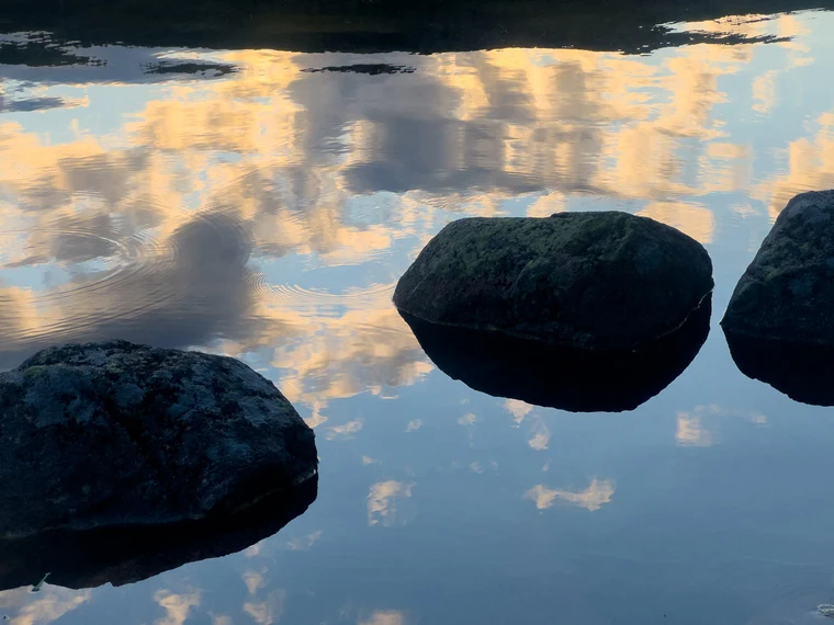
Three boulders, three reflections, against a pond holding the sky. There were probably a dozen rocks at my feet. I kept these three because they were enough. The black band at the top stops the eye from drifting out of the frame.
© RRjr
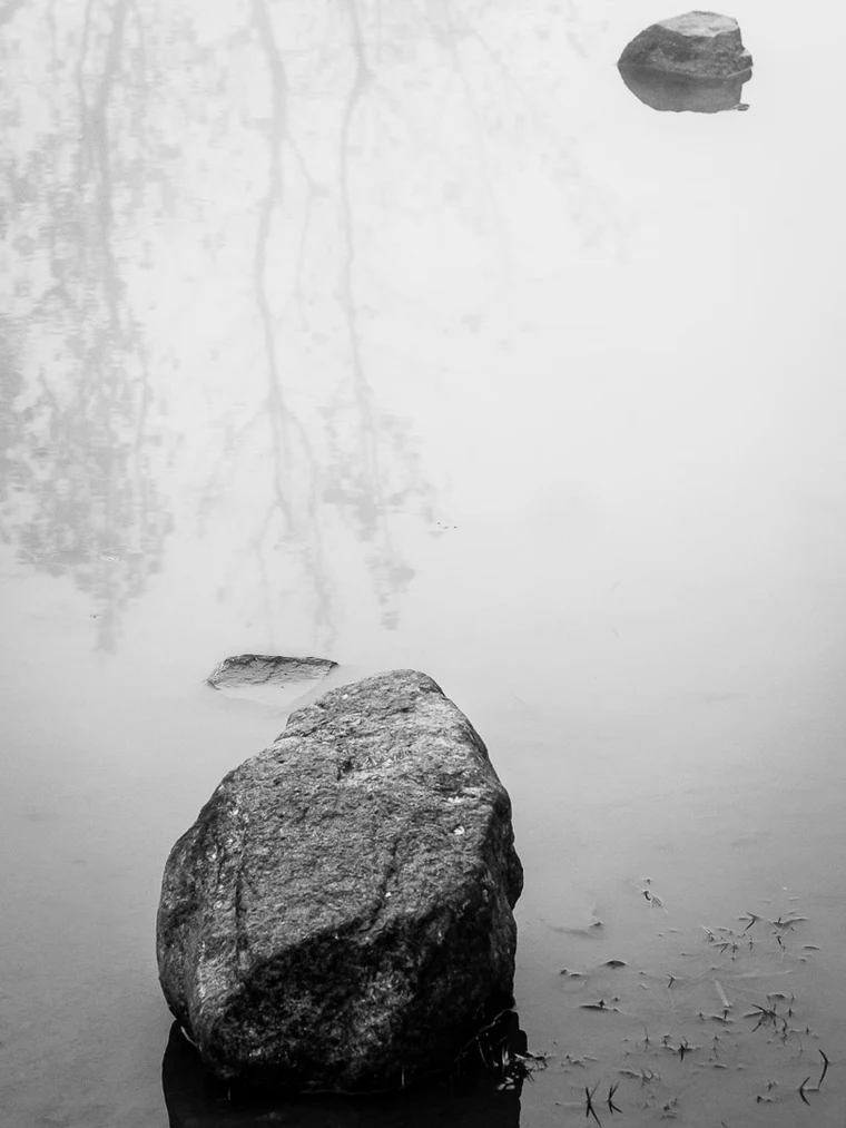
A pool on a hike, a dozen rocks I couldn't use, and one I could. The reflected branches give a sense of place without competing with the boulder. Everything else in the scene stayed out of the frame on purpose.
© RRjr
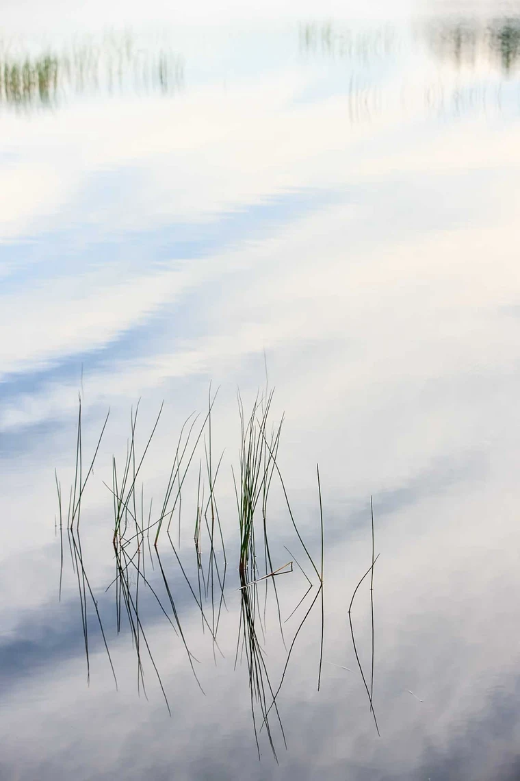
Shallow depth of field is another way to exclude. The reeds stay sharp. The far shore goes soft. The picture is no longer about the pond, it's about a few stems holding their shape against everything dissolving around them.
© RRjr
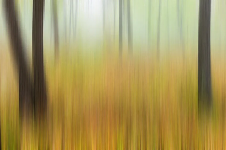
A two-second exposure, the camera moving on purpose. Intentional camera movement is exclusion at the level of detail. The trees become bars of color, the forest floor a wash of warmth. Everything I couldn't make work as detail, I let go of as motion.
© Hiroshi Sugimoto
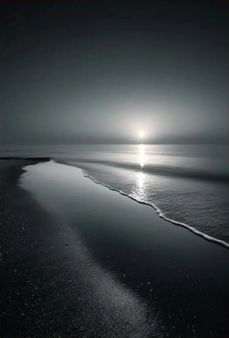
A small moon over a long beach. The brightest point in the frame is tiny, but the whole image points at it. Everything else, the reflected light on the wet sand, the line of the shore, is in service to that one bright dot.
© Charles Cramer
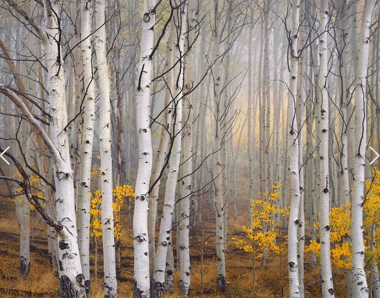
Hundreds of trunks, and yet the image reads as one idea, because the pattern is uniform enough that no single tree pulls you off. The yellow leaves are accents, not competition. The forest dominates by repetition.
© Jay Maisel
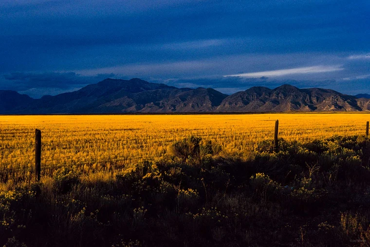
The dominant thing is the light itself. Everything not lit is in shadow, so the yellow band becomes the entire story. The mountains hold the back. The fence posts barely register, which is the point.
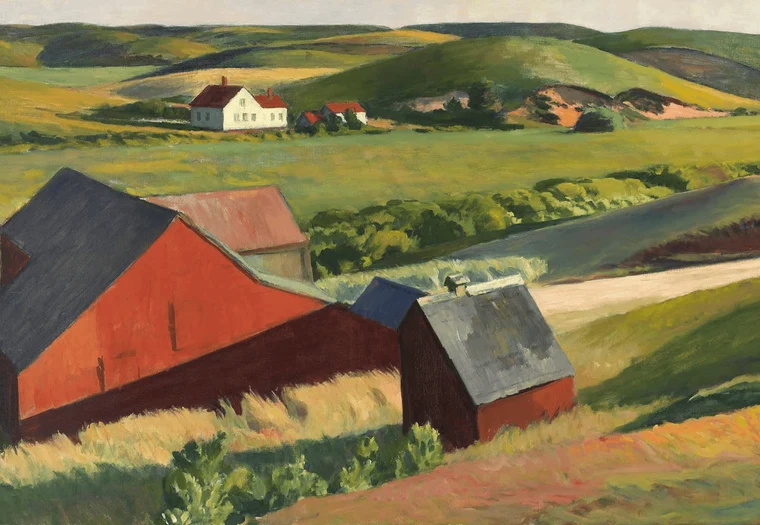
© Edward Hopper
The red carries the picture from foreground all the way back to the small farmhouse. Red against green is the strongest color contrast in nature, and he uses it as the spine of the composition. The eye moves where the red moves.
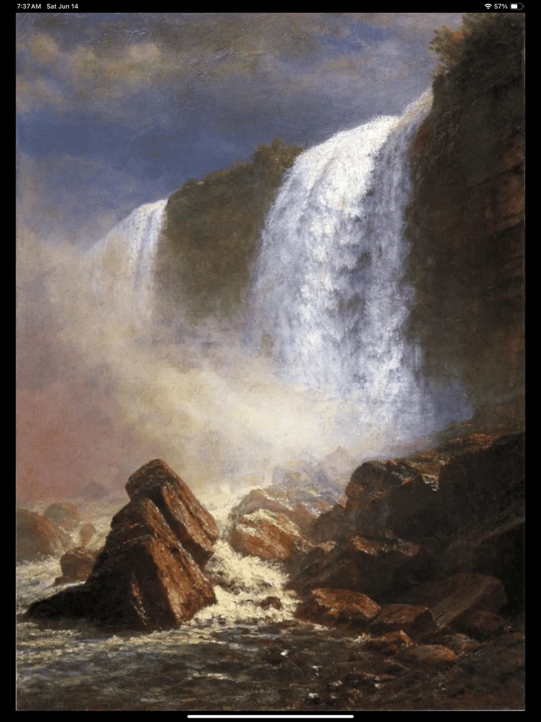
© Albert Bierstadt
The white of the falling water is the loudest thing in the painting and there's nothing to compete with it. The dark rocks frame it, the spray softens its edges, and the eye rides the water down and out at the bottom.
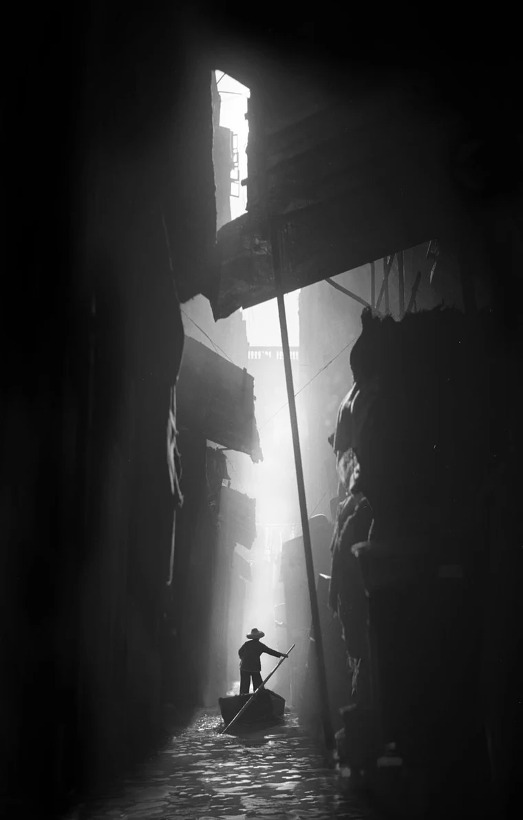
© Fan Ho
The edges of the frame are dense with stuff, awnings, walls, hanging cloth, but all of it sits in shadow. The shadow simplifies it. Only the lit center matters, and that's where the figure lives.
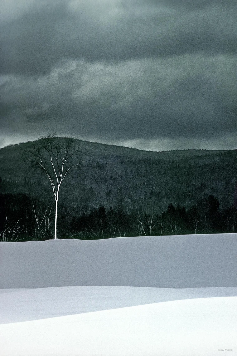
© Jay Maisel
A white bare tree against a dark wooded hill. The bottom of the frame is bright snow, the top is heavy sky, and the eye still climbs straight to the tree. That's because contrast, not brightness, controls hierarchy. Light against dark wins every time.
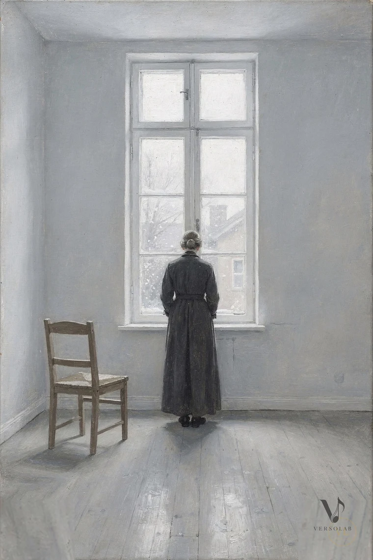
© Vilhelm Hammershøi
The room is a soft gray wash. She is the only deep dark in the frame. Whatever the painting means, that contrast alone tells you where to look.
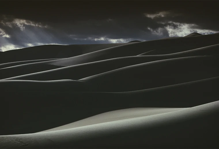
© Ernst Haas
The shadows are doing all the work. They hide every grain of detail in the sand and leave only the lit ridges, which fall into intervals like a rhythm. The sliver of blue at the top is the only color allowed in.
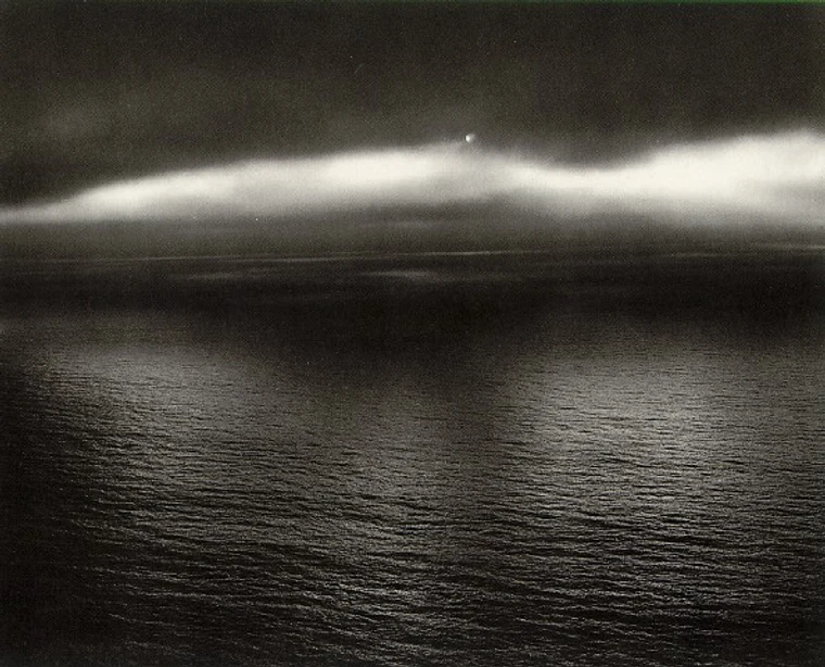
© Minor White
The water and the sky barely separate, and yet the picture holds. He isn't showing you the ocean. He's showing you a feeling that he was carrying that day, working it out through tone. You can't stop looking at the seam between water and cloud.
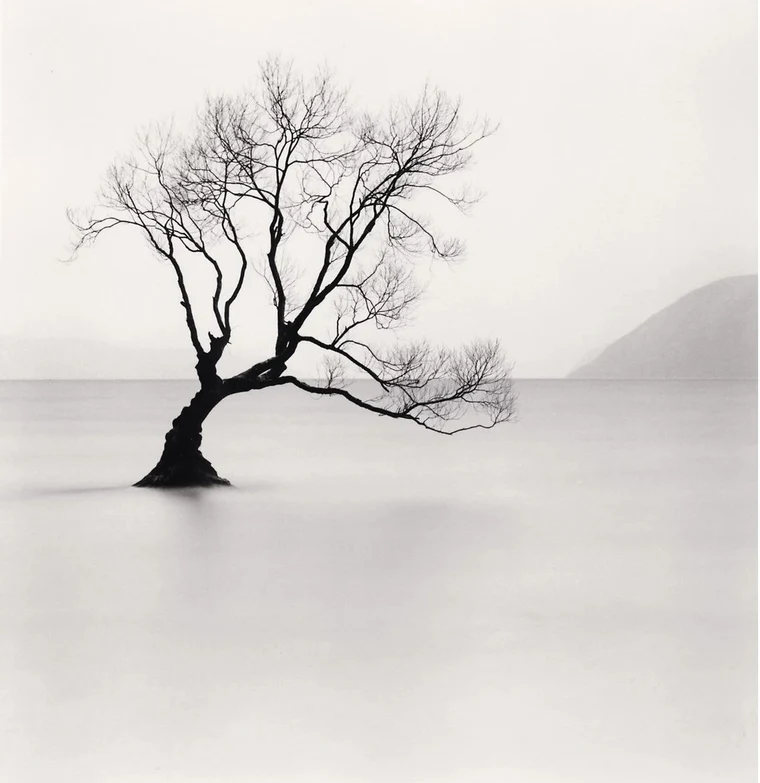
© Michael Kenna
He gives the tree most of the frame, then leaves just enough space around it to let the viewer add the feeling. Lonely. Resilient. Patient. Long exposure smoothed the water flat so nothing competes. Space becomes mood.
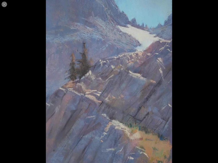
© Bill Cone
The diagonal of light moves you up through the rocks, pauses on the tree, then keeps going. Most of the frame is dense, but the small patch of sky in the corner releases the eye. That little release is the whole composition.
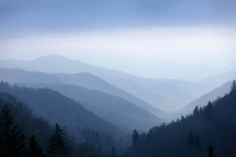
© RRjr
The Smokies in fog. Ridge stacked behind ridge, each one a slightly paler form. The picture is built from layered shapes, not from any one of them. The space between the ridges is the subject. The closer dark trees ground the frame so it doesn't float away.
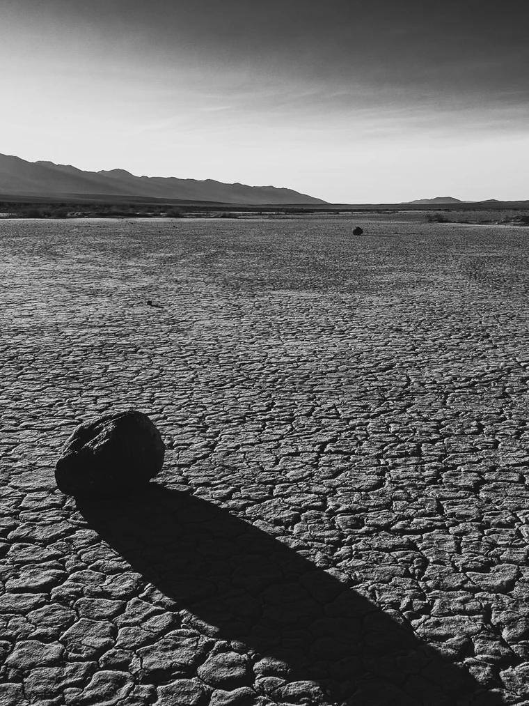
© RRjr
One rock, one shadow, a cracked plain. The shadow is bigger than the rock and does more work. It carries the eye across the foreground and pins the composition together. Without the rock, the patterns in the mud read as noise. With it, they read as ground.
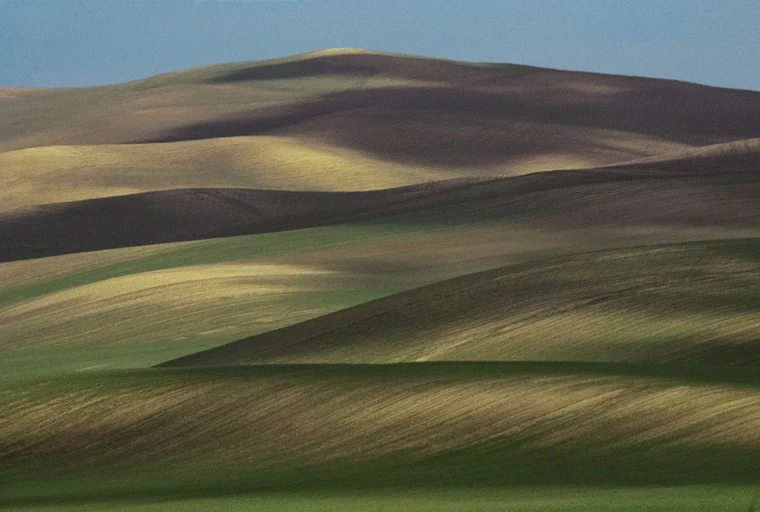
© Franco Fontana
Repeating shapes with just enough variation to never feel mechanical. The space is the rhythm between the forms. Strip the color and the geometry alone would carry the picture.