
A Photographer’s Guide to Color Theory
Of all the elements of visual design, color has the greatest psychological and emotional influence. A big reason for this is that our perception of color is created by the mind after the visible wavelengths of light are processed by the brain. This makes color a subjective experience and very much a matter of personal taste.
However, these are nuances, and fortunately, there are general principles about how we see and respond to color that you can use to make your images more impactful and personal.
Goethe’s Theory of Color, published in 1810, laid out a formal theory on the nature, function, and psychology of color. It described the impact of different colors on mood and emotion, many of which have been confirmed by science some two centuries later.
For example, the color yellow is said to “carry with it the nature of brightness and has a serene, gay, softly exciting character.”
Blue is described beautifully as follows: “As the upper sky and distant mountains appear blue, so a blue surface seems to retire from us. But as we readily follow an agreeable object that flies from us, so we love to contemplate blue — not because it advances to us, but because it draws us after it. Blue gives us an impression of cold, and thus, again, reminds us of shade.”
No matter how accurate these descriptions are, there’s no denying that different colors have real visual and emotional effects. Using them in your compositions can help you convey a sense of mood and atmosphere in your images.
Color theory is a huge topic, but I wanted to share some basics that you can start using right away. First, let’s go over some definitions. We describe color using three properties:
- Hue: The actual wavelength of color, given by its name; red, green, etc.
- Luminosity: How light or dark a color is; clear blue skies are fairly light, while the ocean is a rich dark color.
- Saturation: How intense a color is – remove all the saturation and it becomes grey.
(*Note that these are the same properties used in Lightroom’s Color Mixer panel.)
Next, I recommend getting familiar with the color wheel. You’ll learn which colors are complementary (opposites) and which are analogous (similar), creating harmonious combinations. Achieving color “unity” is the ultimate goal since that adds to the overall sense of harmony in your image.
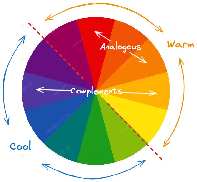
Here are some important aspects of the color wheel and how to apply them when composing your images and editing them in post.
Warm & Cool
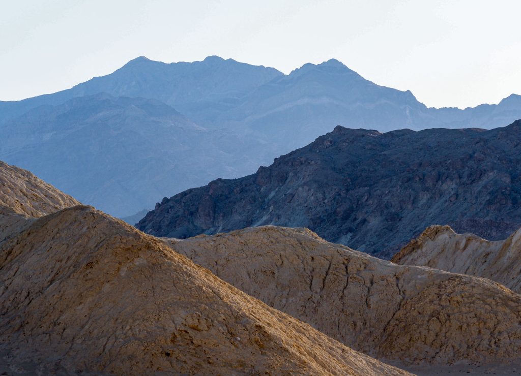
The color wheel can be divided into warm and cool sides. These opposite or complementary hues are extremely powerful when played against each other. Warm colors tend to appear closer to the viewer, while cool colors will recede or move farther away. This is very useful in creating the illusion of depth or a sense of tension between different parts of an image.
For instance, a small area of warm color will seem more dramatic when surrounded by cool colors, and vice versa. Similarly, sunlit areas in the foreground will have more energy when balanced against blue skies or cooler backgrounds such as distant mountains, etc.
The most powerful tool here is the Temperature adjustment, which balances the warm and cool quality of light in your image. Unless you need perfectly neutral greys or whites in your image, adjust the temperature to give the image the mood and feel you want, and expand the difference between the warm and cool areas to create depth and dimension.
The Tint adjustment is also very useful as it balances another complement on the color wheel: greens vs. magentas. If your image has a slight green cast, move the tint slider to add more cool reds, which is great for skies and skin tones.
Analogous Colors
Analogous colors are those that are close to each other on the wheel and can be used to create both interest and unity in your image. Patterns and repetition are strong design elements that can be created using areas of analogous color.
Similar colors help create a sense of movement when they are separated by dissimilar colors or no color at all. For example, greens in the foreground and background will help connect or bridge those two areas, simplifying the composition and creating depth and movement.
Colors as Shapes
Colors can also be used to create shapes and masses, which can help lead the eye to your center of interest. Always try to stay aware of how colors are distributed in your composition and where they create boundaries that can either reinforce your leading lines or distract and even lead the viewer out of the frame.
Color Contrasts
Certain colors convey particular emotions and/or attract our eye more than others. For example, a bright red shape will disproportionately attract more attention than other colors, so be careful that it’s not on the edge of your frame or isn’t part of the center of interest.
Another thing to remember is that the intensity of a color, otherwise known as its saturation, is relative depending on its neighboring color. That means there are two ways to intensify a color: add saturation to it, or remove saturation from surrounding colors. Don’t assume you always have to add more; often, less is better.
Many times, I prefer to remove the intensity of neighboring colors since that produces a more organic and natural look, especially in landscapes and skin tones. The Color Mixer in Lightroom is great for adjusting specific colors in your image to work more harmoniously with neighboring colors.

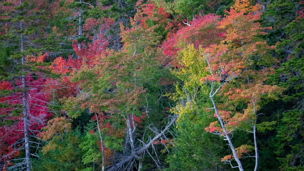
Hopefully, when you go out to photograph again, you’ll think about the color wheel and some of these ideas. I think you’ll gain a sensitivity not just for individual colors, but for how colors work together, especially in terms of visual design. There’s always more to learn, and that, for me, is so exciting.