The Case for Committing
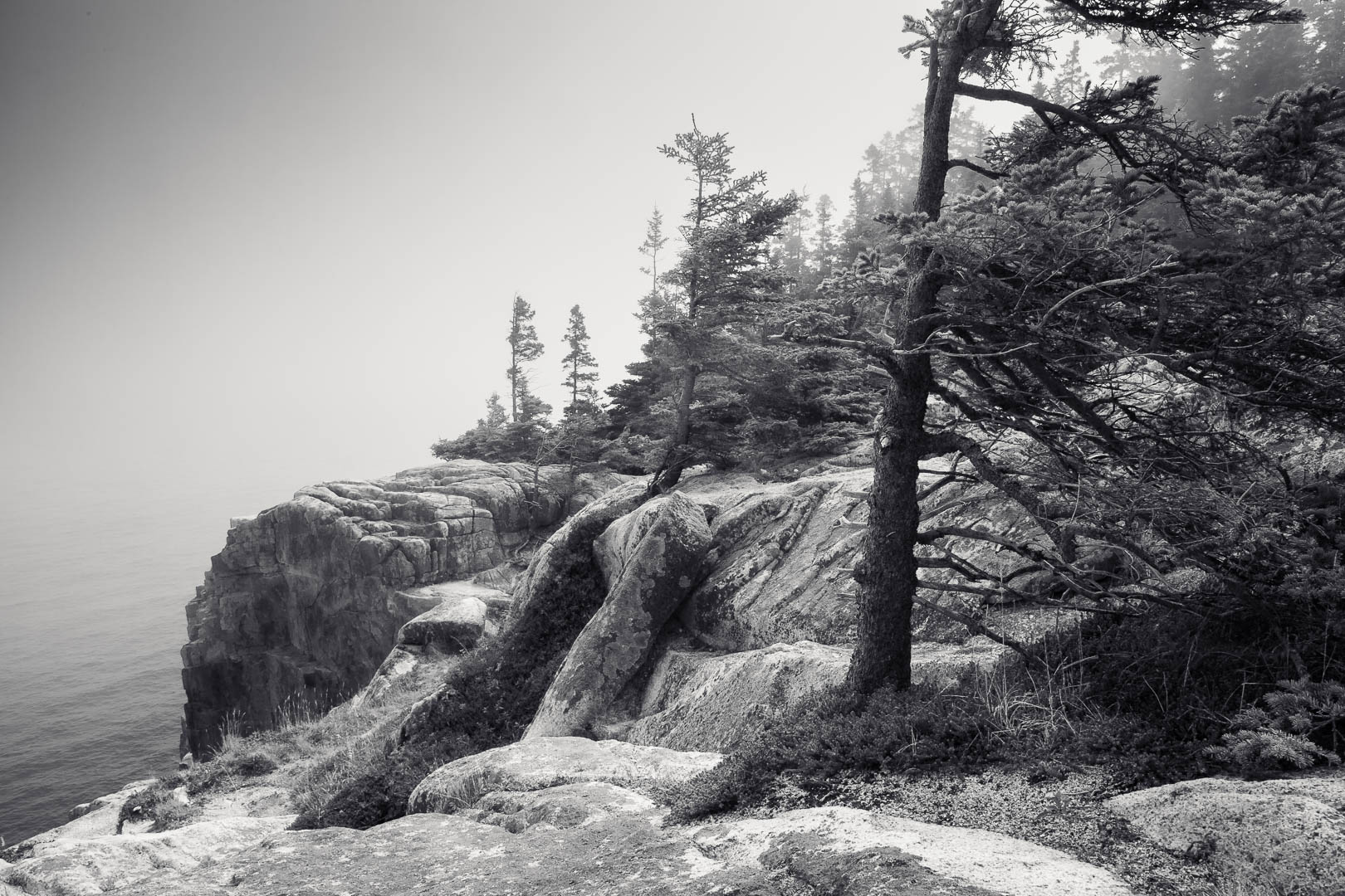
Have you ever had an image that seemed to work equally well in color and in black and white?
During our last Academy session on black and white photography, a member asked a question that stayed with me long after we ended: if an image looks strong both ways, does it really have to be one or the other? Couldn’t you present it in color in one setting and black and white in another, depending on where it’s being shown?
It’s a good question, and on the surface, I think both can look good. I’ve been in that exact situation with my own images myself, and I’ve gone back and forth while the image sits in my catalog for years. That’s exactly what makes it worth taking seriously, because the appeal of keeping both is real. It feels like freedom and flexibility, like you’re preserving your options and giving the image more places to live.
But the truth is that ambiguity isn’t freedom, it’s a decision you haven’t made yet.
Two versions of an image can both be pleasing, but only one can be the image. The difference comes down to the only question I keep returning to in my own work: what is your image about? Once you can answer that, the choice stops being a matter of taste, because color either serves what the image is about or competes with it.
Color isn’t neutral. Our brains respond to it so powerfully that it always does something, whether we’re aware of it or not. So if both versions truly feel equal to you, that isn’t information about the image. It’s information about you and the work left to be done.
There’s nothing in a raw file that decides whether it should be left in color or interpreted in black & white. That’s because your camera doesn’t decide what the picture is about, whether it’s about the warm light or the graphic shapes beneath it. The interpretation is where you get to decide which of those is the real essence of the image, why you pressed the shutter.
Now, I’m not suggesting an image can only ever exist in one form for all time. If you return to an image years later and make a genuinely new version of it, fully committed, that isn’t indecisiveness, that’s real growth. The distinction I’m drawing is between making two complete statements and keeping two versions because deciding feels too final.
And this is where it matters for your work, even if you never interpret your images in black & white. The willingness to commit to what an image is about carries into everything: how you edit, what you leave out of the frame, how you talk about your work, even what you notice the next time you’re out with your camera. Indecision compounds too, just in the wrong direction. Creative constraints are where clarity lies, not endless choices.
If you’d like to put this into practice, try the exercise I gave the Academy this week. Choose a handful of color images you’ve never quite resolved, the ones you like something about but could never make work.
Before touching a single slider, ask what each one is about: the color, or the form, tone, and light? Then press V in Lightroom and simply watch what gets stronger and what gets weaker. But add one step I didn’t mention in the session: decide. Pick the version that serves what the image is about, and let the other one go.
You may find, as I have, that the image you kept is the one you stop reopening.
If this way of working is something you’d like to develop, it’s the heart of what we work on inside the Creative Path Academy, together, every month. And if one-on-one guidance fits you better, take a look at my three-month mentorship. Not sure which is right for you? Book a free call and we’ll figure it out together, no pressure.