Why the “Best” Paper Doesn’t Exist
Printing your own work is one of the most effective things you can do to grow as a photographer. You experience your work in an entirely new way that can provide meaningful insights, and you also gain the ability to let others experience your work at a deeper and more appreciative level.
Once you start, paper choice becomes the single biggest factor in how your prints will “express” the story of your image. And you’ll quickly realize that with so many paper options available, it’s easy to become totally overwhelmed.
So here’s my suggestion: start with just two papers. One matte, one non-matte.
Why? Because the depth of the blacks that a paper can produce, known as Dmax, is the single biggest aesthetic difference between all papers. Matte papers (lower Dmax) produce subtle, nuanced, more suggestive and painterly prints.
Non-matte papers (higher Dmax) produce more aggressive, louder, higher contrast prints. And that difference changes the look and feel of your image.
For the non-matte option, Canson Infinity PhotoSatin Premium RC is an excellent choice. It gives you access to those deeper blacks, and lets you learn with a great paper at an entry level price point. When you’re ready to move up, Platine Fibre Rag will provide that museum grade look and feel, plus the longevity of a true archival print.
For matte, Canson Rag Photographique II is a reliable workhorse. Smooth surface, beautiful tonal range, great blacks for a matte paper, and works well with a very wide variety of images.
(I’m recommending Canson papers because they’re what I use and trust, but this matte vs. non-matte framework applies across any manufacturer.)
Then do something that might feel inefficient but is actually essential: print the same image on both papers. Hang them side by side. Live with them for a few days. Notice which one keeps catching your attention. Notice which one feels right for that particular image.
This isn’t about finding the “winner.” It’s about building your intuition for which paper serves which type of story. That intuition only develops through reflection, through actually living with prints and paying attention to your responses.
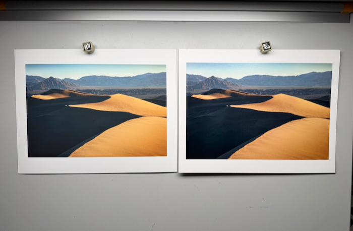
Paper selection isn’t a problem to be solved; it’s an opportunity to deepen your relationship with your own images. I’m probably 75% matte papers, because most of my work gravitates toward quieter, more contemplative images, so matte surfaces serve my vision most of the time. But that’s me. Your work might be completely different.
Every time I approach a print, I’m asking myself: what is this image really about? What feeling am I trying to preserve and share? What story does this image want to tell?
And almost always, the amount of dmax or contrast a paper provides determines my answer to those questions—based on what I want to convey with the image.
And that answer might be different for every image. Which is exactly as it should be.
If you want to explore this kind of intentional printing process more deeply, the Creative Path Academy includes regular Print Lab sessions where we work through these decisions together, looking at real images and real prints.
Inspiration
“Attention is the rarest and purest form of generosity.” — Simone Weil
Stay Connected
If this way of thinking about photography resonates with you, I share ideas like this in my free newsletter. No spam, no sales pitches — just honest thoughts on seeing, creating, and growing as a photographer. You’ll also get a free guide on my composition framework you can put to use right away.