
Your Print Is Not a Copy of Your Screen
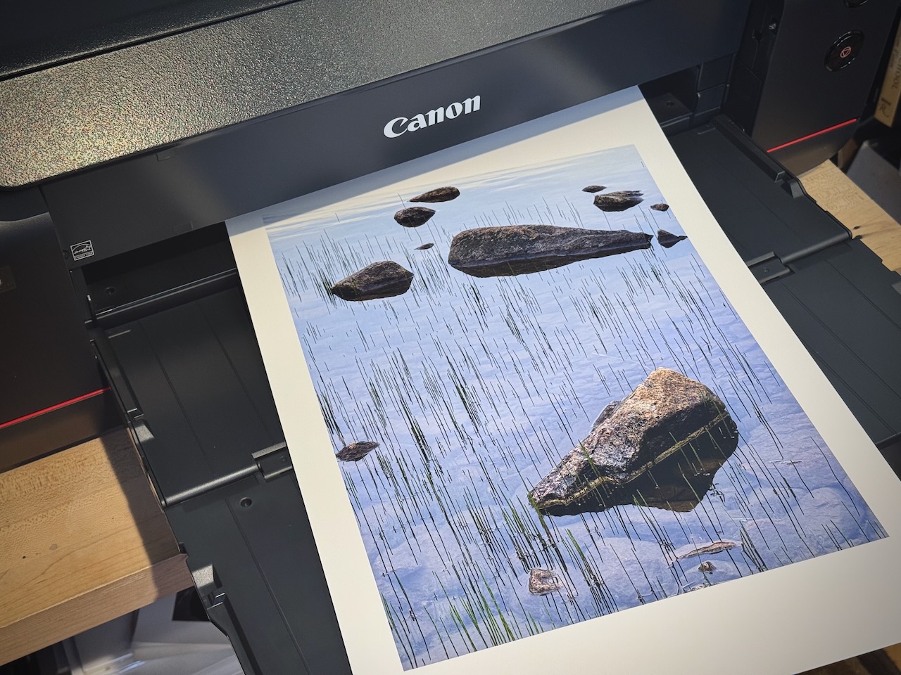
There’s a question I’ve been thinking about for a long as I try to help students become better at printing their work: Is the monitor your source of truth?
Most people don’t hesitate. Of course it is, that’s the image, that’s what I edited and that’s what I want the print to look like. And I understand that, because I’ve thought that way as well. You spend time with an image on screen, you adjust it, you live with it, and over time that version burns into your memory. It becomes the benchmark. And when the print doesn’t look exactly like what’s on screen, the print isn’t working.
But here’s what I’ve come to believe after twenty years of printing: that instinct to perfectly match the print to the monitor is actually working against you. It keeps you tethered to a middle step in the process when the print itself should be the destination.
The Score and the Performance
One of my favorite quotes comes from Ansel Adams, who said that the “negative is the score, and the print is the performance.” It’s not a coincidence that Adams chose musical language. He was a Juilliard-bound pianist before he changed careers, and I think his musical training gave him a particular insight into what interpretation really means.
A composer doesn’t just jot down his first ideas and call it a score. He refines, revises, shapes those initial inspirations into something intentional and fixed. The score is the finished composition. But every pianist who sits down to play that piece brings something different, their own background, their own sensibility, their own way of hearing. The score is identical, but the performances are not, and that’s the whole point.
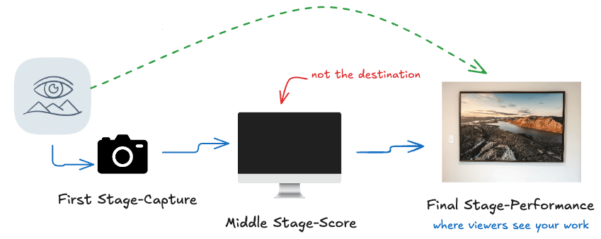
That’s what printing is, or at least what it can be. The raw capture is not your score, it’s your raw material, like the composer’s first sketches and inspirations. The score is what you create from that, the edited image on your monitor, the intentional interpretation you’ve refined through your adjustments. If you’re printing, that’s the middle stage.
Breaking the Chain
The problem is that for many that middle stage becomes the destination. Every evaluation of the print gets filtered through what’s on screen. The blacks aren’t quite as deep, or the orange isn’t as vivid. And all of those observations are being measured against a monitor that no one besides you will ever see.
When someone walks into a room and sees your print on the wall, they don’t ask to see the digital file. They don’t ask what it looked like on your monitor. They just experience the print. That’s your performance, and that’s what they’re responding to.
I have a print hanging in someone’s home, a landscape from a cold winter morning after a forty-five minute hike to catch the sunrise. When I look at that print, I’m not thinking about whether the blue in the sky matches what was on my screen.
I’m thinking about whether it captures something of what that morning felt like, the long hike in the dark, the gratitude of arriving just in time, and that feeling afterward when I put my camera away and just stayed, because there was nowhere else I wanted to be. That feeling is what the print is for. Is the blue exactly the same hue as my monitor? It’s very close, and that’s good enough for me.
I’m not suggesting the monitor doesn’t matter. Quite the contrary, it matters a great deal just as the clarity of the composer’s score matters to the performer, to make sure I’m working with the best idea of what my print should look like. That needs to be as accurate as possible so that my performance, the print, has the freedom to express its own uniqueness.
The Paper Is Your Instrument
If the print is a performance, then the paper is your instrument, and choosing it is one of the most consequential creative decisions you’ll make. A glossy, high-contrast paper is like turning the volume up. It’s punchy, vivid, aggressive, it screams out at you. A matte paper is softer, quieter, more intimate, it invites you to come closer. Neither is better. They’re different instruments for different intentions.
And those words, louder, softer, quieter, they aren’t just descriptions of paper characteristics. They point to emotions. If you speak to your family in a soft, quiet voice, you get a very different response than if you’re loud and forceful. It’s the same with paper. A shiny surface shining back at you creates one kind of experience, a matte surface with texture creates something entirely different, something more painterly, more personal.
The point is that paper choice should be guided by the feeling of the image, by what you want the viewer to experience, not by which surface most faithfully reproduces what’s on your monitor. That print I mentioned earlier is on a matte paper, because the feeling of that morning wasn’t loud or aggressive. It was more like the scene whispering to me, stay here and take this in.
Why Prints “Look Better in the Morning”
This is why I suggest you hang your prints somewhere and live with them for a while before making any final judgements. The screen image fades from immediate memory, and the print begins to exist on its own terms. You stop comparing and start seeing the print on its own terms.
That moment when you notice something in the print you never saw on screen is one of the most rewarding parts of the process. It tells you that a print can reveal things a monitor hides.
The next time you make a print, don’t immediately hold it up next to your monitor. Walk away from the screen. Look at the print in natural light. Give it a chance to speak for itself. See if it can deliver something the monitor can’t.
This is the kind of creative craft we explore in the Print Lab sessions at the Academy, where members bring their own prints and we work through these interpretive decisions together.